
Colour matching: is it worth the headache?
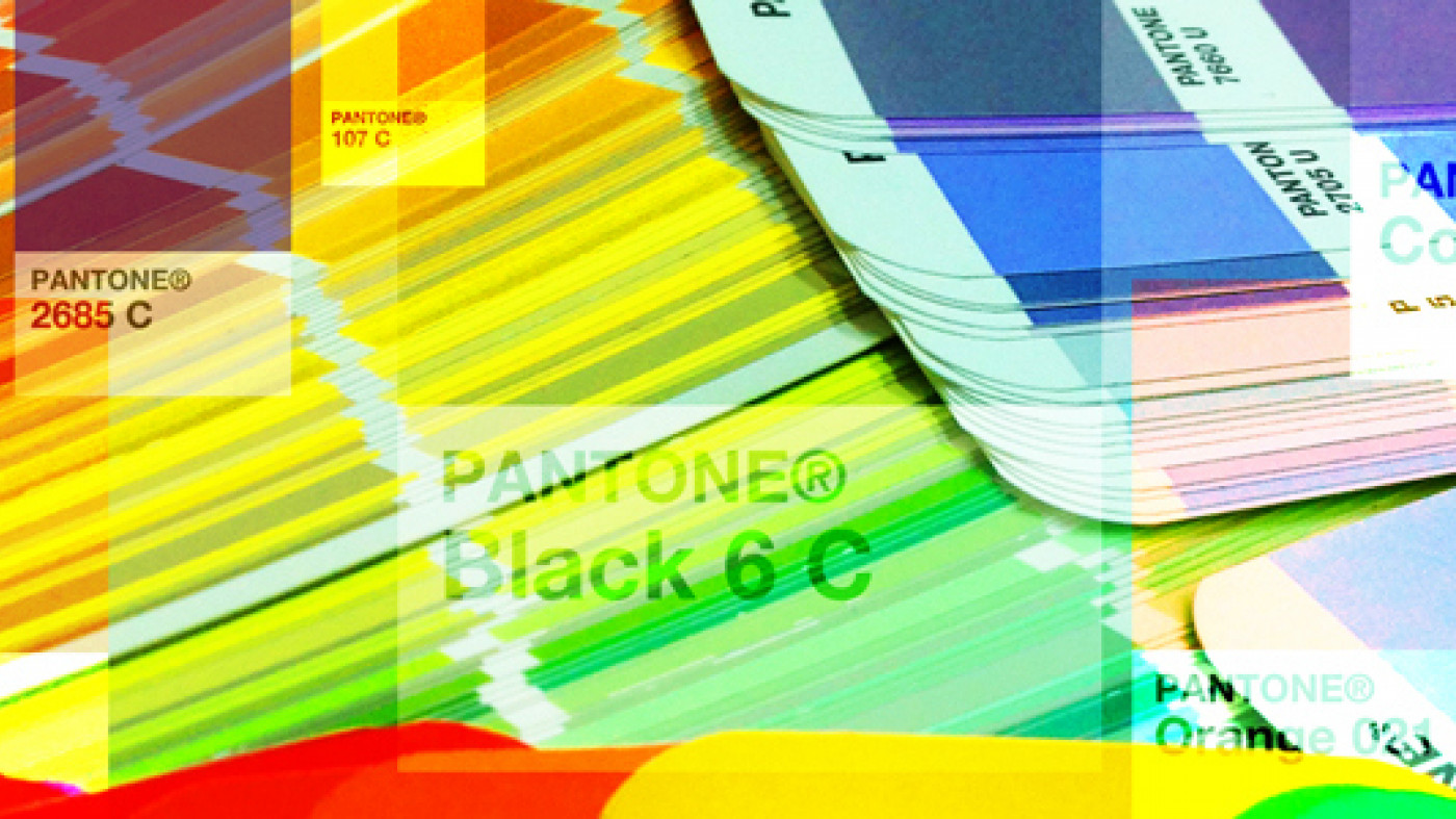
The use of colour in branding has taken a prominent place in the news recently. You may have read about the recent Cadbury case in which they staked claim to their brand colour, Pantone 2685C, the particular shade of purple which they have been using on their confectionery for over 100 years. Pantone didn't exist 100 years ago, but when their colour referencing system was developed, Cadbury had the foresight to select a Pantone reference to ensure future colour consistency.
In designating an industry standard swatch to their colour, Cadbury is ensuring that there is an embodiment of that colour available to every manufacturer they ever need to use and limit the usage of that particular colour by competitors.
Is it really that simple?
No, but there are steps that all brands can take to ensure the protection of their brand integrity and recognition in the market place. Cadbury is a global brand that would demand a high level of service and accuracy, yet whilst researching this piece, I discovered that a large proportion of the articles on the Cadbury case, including those in Marketing Week, The Independent, and The Telegraph, quoted the wrong Pantone reference 2865C as opposed to 2685C. This goes to show that information can be lost or misunderstood and that those mistakes can and will be passed on.
One way of reducing the likelihood of these mistakes occurring is to employ a brand guardian (an individual or department within a company, or an external body) to manage the implementation of fonts, designs, and colours. Not everyone can justify or afford such a luxury, but more predictable colour-match results can be achieved by having a broad understanding of the colour application and reproduction in-house.
Exact colour matches across a range of these production processes using the limited standard ranges available are unlikely. Not all colours can be easily reproduced (or at all in some cases) on different media, so sometimes settling for a shade or two either side of a first choice colour will open up more opportunities for ease of manufacture. It's not realistic to expect everyone to keep a full library of swatch books for all media and across all colour referencing systems, but every studio should keep a range of Pantone swatch books as a bare minimum, even if they are relatively expensive and do need updating on a regular basis. Furthermore, RAL and Dulux books will pay for themselves in saved time and effort down the line.
Creating the correct colour
All colours are made up of a mix of other base colours. Screen, print and paint colours are generally made up of a combination of 3, 4 or 6 colours. The more base colours, the larger the spectrum achievable.
RGB is the 3-colour model used for screen displays. It's a mix of light (as opposed to pigment). The range of colours achievable (gamut) using RGB is smaller than the range of print colours. This means that your print or paint colour may not be replicable on your website. There are tables available online which can establish whether your hexadecimal (web colour reference) or RGB colours have a match with other colour swatch books.
The main models used for printing are Process Colour (where 4 colours are laid onto the media to give the effect of different colours), and Spot Colour (where the inks are pre-mixed and the final colour is applied to the paper or other substrates). A 4-colour CMYK print is perfect for images and graduated colour, but results can be unpredictable and differ from one printer to another. There are no swatch books for CMYK breakdowns and therefore no master reference.
For flat (or metallic) solid colours, Pantone shades are ideal as references. They have a constant, universal reference ensuring that whoever prints the colour will know exactly which shade they should be aiming to output. There is also a wide range due to the 6-colour breakdown. Most printers will be able to calibrate their machines to output accurate spot colours.
It's best to avoid percentage of tints and transparencies when looking for an easily-replicable colour. Again, unless there's a reference to match to, results cannot be guaranteed.
Another alternative for displaying flat colours to a surface is self-adhesive vinyl. There are many types with varying levels of translucency and texture. The range of colour, however, is fairly limited within recognised manufacturers standard ranges. Simply choosing the closest match may not produce satisfactory results, so with the additional expense (and possibly large minimum orders), it may be necessary to custom print.
Colour matching to order has been around for many years. The way the general public may most be familiar with it is via the Dulux colour matching facilities in DIY stores. Paint can be matched to anything however this technique can cause difficulty in the future when elements have to be replaced and the colour has to be reproduced again.
Colour around the globe
The constraints and considerations for a small job are different from global rollout projects. Such jobs don't necessarily have the complications of matching colours through a variety of different processes across regions of the world using countless suppliers, allowing greater freedom for selection of colour. Unfortunately, for large, multinational colour reproduction requirements, it may be mindful to compromise on colour to maximise potential consistency… particularly when the alternative involves quality checking far-flung manufacturers at great expense and inconvenience.
Endpoint builds a bridge across the gulf between designers and manufacturers, and are often tasked with ensuring that colours are reproduced consistently across several different media.
Don't leave the implementation of your precious brand assets to chance. If you're having trouble with your colours or anything to do with your implementation, get in touch.
Resources
www.goodreads.com/Oscar_Wilde
www.independent.co.uk/cadbury-wins-right-to-the-colour-purple-6262717.html
www.davidairey.com/colour-in-branding/