



Inside Dalton Maag’s approach to type design
Dalton Maag is an independent international type design studio whose work includes fonts for Airbnb and Amazon, alongside place identity projects for the City of Vienna and Southampton City Council. That experience gives Riccardo a valuable perspective on the relationship between brand expression, legibility and the practical demands of wayfinding.
Dalton Maag specialises in designing typefaces and developing the font software that makes them usable. Its work covers custom fonts, modifications to existing designs and a library of typefaces available to license.
In the conversation, Riccardo explains how the studio’s international team brings knowledge of different languages, writing systems and visual traditions to its projects. He also describes the library as a space for experimentation, where designers can explore ideas outside a client brief.
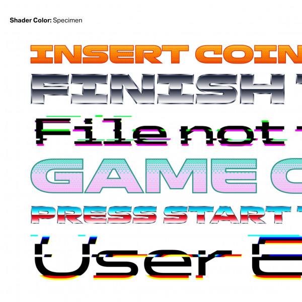
Shader Color is one example. Inspired by gaming aesthetics, it explores how colour font technology can bring shades, transparency and different palettes into live text.
Making typography work on signs and screens
Physical signage and digital interfaces place different demands on typography.
Signs need to be read at a distance, often within limited space. Text on a phone may be smaller, appear in longer passages and benefit from more generous proportions.
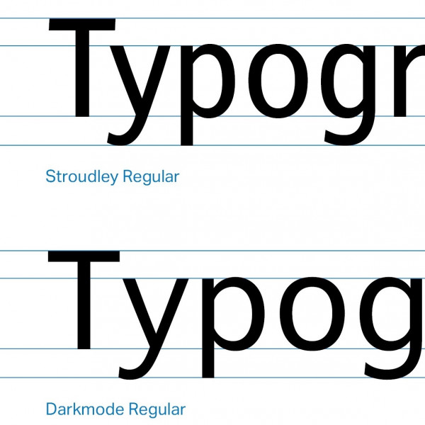
Riccardo illustrates this through Stroudley, developed for signage, and Darkmode, a related design adapted for digital interfaces. Their differences show why a connected visual identity does not always mean using identical letterforms everywhere.
For wayfinding, the wider challenge is to make physical and digital navigation work together as part of the same journey.
Choosing a legible typeface is only the beginning
How a typeface is used matters as much as the choice itself.
Riccardo discusses letter spacing, size and weight, alongside features such as open letterforms and a generous lowercase x-height. He also explains the importance of distinguishing characters that can look alike, including an uppercase I, lowercase l and numeral 1.
These details become particularly important when someone needs to read information quickly and confidently.
Considering every writing system from the start
Multilingual typography involves more than finding fonts that look similar.
Different writing systems have their own proportions, visual traditions and cultural associations. A successful combination needs to consider apparent size, visual weight and hierarchy, as well as the character each typeface conveys.
Riccardo recommends planning for all required languages and writing systems together. Designing in English first and fitting the others in afterwards can make it harder to create a coherent result.
Finding the right approach to bespoke typography
A typeface designed for a place can offer an opportunity to express its heritage and character. Riccardo considers how that process could also involve the community, helping inform a design that feels particular to its surroundings.
He discusses the practical options available to different projects. A fully custom typeface offers control over the design, while modifying an existing font or combining custom lettering with a library typeface may suit other needs and budgets.
Understanding what the project requires is the starting point for choosing between them.
Listen to the full conversation
Hear Riccardo De Franceschi discuss typography, wayfinding and place identity on Wayfinding Xchange.
Listen on Spotify | Listen on Apple Podcasts
Explore Dalton Maag’s work and font library at daltonmaag.com.
Discover more conversations with leading experts on our Wayfinding Xchange podcast page.