

Introducing Dalton Maag
As a type design studio, Dalton Maag develops typefaces and implements them into fonts. They’ve been involved with a number of high-profile custom fonts for the biggest names in business, as well as smaller brands. Dalton Maag doesn't do graphics for web, print, or animation – their focus is purely on typefaces, which they develop for several writing systems.
Between them, Riccardo and Dalton Maag’s team of font design specialists cover 25 nationalities, speaking 14 languages. This comes in useful when working with brands from different places around the world. For people getting to know Dalton Maag for the first time, their catalogue of retail typefaces is a good place to start. In fact, their team uses this library as a playground for experimenting with ideas, pushing the envelope of what’s possible with typography.
Taking typography to the next level
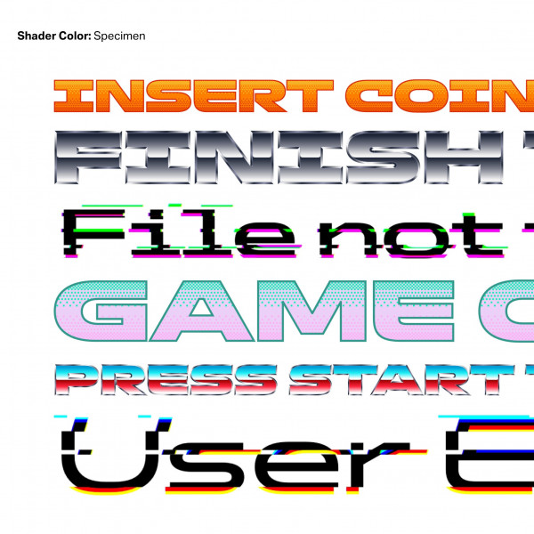
Take their recently developed ‘Shader Color’ typeface, for example. It’s an experiment in the aesthetics of gaming. Recent advances in font technology enable colour fonts to be much more powerful than ever before, including different shades and transparencies – all as live text. Riccardo sees the gaming industry as an exciting field for typography. Related technologies such as Virtual Reality (VR) and Augmented Reality (AR) are also emerging markets.
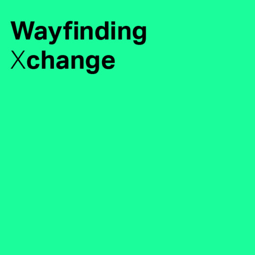
From a wayfinding perspective, typefaces need to appear consistently across digital and physical mediums, from signs to apps. One fascinating challenge for the future may be recreating real-world experiences of physical lettering – in terms of depth and light – inside virtual digital environments.
From physical to digital wayfinding
For both Dalton Maag and Endpoint, one aspect that defines lettering in the built environment is its permanency, which has an obvious cost implication. This impacts the choice of letter styles for wayfinding, which are often compact and space efficient. Physical signage is also designed to be seen from a distance, so there are further requirements around legibility and accessibility.
When it comes to user interfaces (UI) and user experience (UX) inside the digital environment there is a different set of challenges. Text needs to be read at smaller sizes on-screen and on different devices, sometimes for longer passages of text. This means that type may benefit from being spaced more generously and having wider proportions to allow it to ‘breath’ on the page.
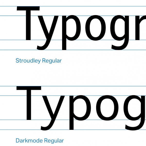
Take Dalton Maag’s font Stroudley, for example. It was originally developed for physical signage with compact proportions. More recently, it has been used as the starting point for a new typeface called Darkmode which is optimised for digital UI/UX. The adjustment includes wider and more comfortable proportions.
Riccardo sees this as a key question around digital type: how do wayfinding designers integrate physical built environment experiences with the digital aspects of navigation? They need a way to enable a navigation experience that integrates physical and digital experiences in one well-thought-out system – a collaboration rather than a division. This way the experience can become more unified.
The anatomy of a typeface
What makes a typeface readable, legible, and accessible? For Riccardo, it’s as much about the typeface you choose as how you use it. It’s possible to ruin a good typeface by setting it poorly.
A sufficiently large ‘x height’ – or the height of a lowercase letter x in a given font – is important for clarity and a crisp appearance on the page (whether paper or digital). Other features which support this are open counters, such as the apertures in lowercase forms of ‘a’ and ‘e’. You need a system that allows enough distinction between regular and bold weight to create emphasis – think of airport signage as a good example.
Regarding weight, it’s also important to consider the minimum recommended size of use. Under a certain size, your lighter weights become too feeble, and the heavier weights too crowded. Riccardo sees disambiguation between letters that can be easily confused – such as uppercase ‘I’ (i) and lowercase ‘l’(L) – as essential. It’s also important to have generous letter spacing and some variation in proportions to provide an organic rhythm to your text and keep the reading experience human-friendly.
Solutions for dual and multiple language projects
When it comes to accessibility, it’s more and more important for brands to think in terms of different languages and different writing systems. Looking back at their handwritten forms is fundamental in understanding different writing systems – such as Latin, Arabic or Chinese.
Creating a similar structure and hierarchy of elements across different writing systems involves ensuring that type appears with similar size and colour. To provide a consistent expression between different locales, whether you want a sense of modernity or heritage to come through, an understanding of the visual tradition and grammar of each writing system is key.
Typefaces, such as those created by Dalton Maag, increasingly cover a range of languages and writing systems, but it’s important to ensure they resonate locally and communicate with a compatible look and feel across different countries.
Keeping down the cost of customised solutions
For a modest architectural project, there are ways to keep down the cost of a customised typeface. One solution is to keep down the size of the character set. For example, Dalton Maag offers an English-only character set with a contained set of symbols and punctuation marks.
It’s also possible to have a hybrid approach – for instance, a custom typeface for headlines with an off-the-shelf solution for running text. Font modifications can also be more affordable – making tweaks to an existing typeface. This approach has implications for the Intellectual Property (IP) of the font, but it does allow the client to have exclusive rights.
There are many approaches to developing and implementing typefaces. As Creative Director, part of Riccardo’s role is to help clients navigate the various options to find one that’s right for them.
Explore typographical solutions from Dalton Maag here.
Our podcast is available on Spotify, Apple Podcast and YouTube. Don't forget to subscribe and rate us!