Managing exhibition design at the National Museum
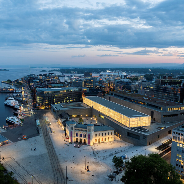
Containing Norway’s largest collection of art, architecture, and design, the National Museum in Oslo opened in 2022. Ragna Jacobsen oversees exhibition design in the education and visitor department.
These days, almost everything is about exhibition design – mostly, temporary exhibitions. In fact, Ragna was working on a Mark Rothko exhibition at the time of the interview. Her role involves designing exhibits and production work, taking exhibits from concept through to mounting and installation.
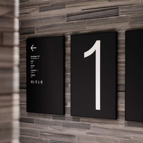
She also has responsibility for working with external designers and collaborators. Prior to the new museum opening, this included a wayfinding and signage design team from Endpoint.
Wayfinding a cultural space for the first time
The National Museum building brings together four major museums under one roof: the National Gallery, the Contemporary Art Museum, the Design and Craft Museum, and the Museum of Architecture.
The idea behind consolidation was to create a hub of expertise, and a better offer to visitors. There was also a need to mitigate the cost of restoring the ageing museum estate, which would have been unfeasibly expensive to fix, and bring up to modern standards.
In a museum, it’s important to consider the complete user journey – from arrival to visiting specific exhibits. Wayfinding was new to Ragna, and she found it a pretty steep learning curve. Her background in 3D design helped, but she didn’t realise how much went into it – even naming became a project in itself! There were also a lot of stakeholders and collaborators involved, each with their own opinion.
One of the key drivers was the need for larger exhibition spaces. Bigger space gives exhibition designers more opportunities to create varied and imaginative visitor experiences. Factors such as getting items into the space, and climate control, also played a part in the need for a new National Museum.
Navigating the challenges of pre-planning
The permanent collection is big – some 10,000 square metres – and the space for temporary exhibitions is a major consideration, including the Light Hall on the third floor. This new and exciting space is versatile and can create unique and special moods. The challenge is that a lot of objects can’t handle too much light.
Another major pre-planning consideration was the visitor journey – how do people feel when they arrive? How do they decide what to do and where to go? That’s why Endpoint was brought in.
Front of house, the museum needed to be friendly and accessible, whilst keeping visitors out of storage spaces and so on. Visualisation of the space – using scale models – was essential for putting designers in the visitors’ shoes.
Back of house was another important consideration. For much of the week, those back-of-house spaces are home to museum staff – and they need to work accordingly.
Enhancing the visitor experience inside the museum
Ragna likes to bring a certain logic to the space, balanced with equal measure magic and surprise. This can come from the artwork, the feeling, or the mood of the space. No matter the source, exhibition design has to support the content. In the initial concept phase, there are workshops with educators, curators, and designers to generate ideas, understand the content, and figure out the stories.
The space and content of an exhibit really impact the visitor experience. For example, the Light Hall ceiling is 7 metres from the floor. The artwork and the storyline also play a part, which means close collaboration with curators. Sometimes design takes an unexpected turn, depending on the target audience or persona.
Text is one way of explaining, but as an exhibition designer it’s interesting to consider other ways to influence the visitor experience. Wayfinding and signage have to say something about the museum experience, as well as being functional. It needs to fit with the other aesthetic components, such as the architecture and lighting.
Visitors have to understand, and find, what's on offer, which can be tricky in a space as large as the National Museum. The size of the building also has an impact on the visitor experience. It’s enormous and people can easily get tired and irritable, so that’s an important consideration when planning movement through the building.
Flying the flag for flexibility
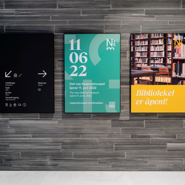
A combination of static and digital signage helps meet the need for flexibility in a constantly evolving cultural space like the National Museum. The changing program of exhibition content is supported by adaptive wayfinding and signage. Physical frames with changeable components help to keep the signage relevant. There are always hard choices to make, but installing permanent signage with the potential for change is a key takeaway from Ragna’s experience – you never know what you need until you’ve tried it for a while.
Weekly meetings between stakeholders help to solve concrete problems as they arise. There is also more strategic, long-term planning, around the exhibitions themselves to ensure there is a balance between the different elements – art, architecture, and design. From historians to marketers, there are multiple collaborators and stakeholders involved with the museum’s overall visual identity. Keeping it cohesive is a huge challenge. It’s a collaborative effort between everybody involved, including designers and front-end staff.
Wayfinding temporary exhibitions
It’s very easy to create a ‘forced path’ in exhibition design. At the other end of the scale, there’s open-ended experience. Designers and curators at the National Museum aim for something in between. This dynamic creates a lot of interesting discussion.
At the bare minimum, a sense of arrival is essential. Entry and exit are also important, as well as getting from A to B. In between, there are a lot of tools and tricks for moving people through the space. Positioning sight lines to a piece of art, or adding interactive experiences, are two techniques for speeding up and slowing down movement through a space.
Another technique is the depth and breadth of information provided. You can create curiosity by revealing less at the beginning and more as people move through the space – before delivering the bigger story. Clearly, there are similarities between exhibition design and wayfinding.
The museum recently onboarded a specialist to test and evaluate the visitor experience. It’s hard for designers to evaluate an exhibition that they’ve worked on themselves. A third party can provide objectivity.
From strategy to opening day
COVID-19 had a huge impact on the construction schedule and impacted certain deliverables inside the building itself. But in terms of wayfinding things worked out well. The project started with a clear wayfinding strategy, and a lot of time was spent on the content before anything was designed. With so many different stakeholders, there were lots of people involved who were coming at it from different perspectives. A strategic approach made the process much smoother.
The opening was attended by the King and Queen of Norway. Although the weather was very dramatic – grey and windy – at a certain point, the sun shone through the clouds. For Ragna, standing inside the museum looking at the long line of people was a special moment. After much anticipation, seeing people of all backgrounds enter the building, spread out, and start finding their way around was an amazing feeling.
It’s a complex building with multiple floors and entrances. When it comes to wayfinding, there’s still work to be done, and Ragnar has created a list. There’s always a list!
To explore further and gain insights into our wayfinding system for the National Museum, please click here.
Our podcast is available on Spotify, Apple Podcast and YouTube. Don't forget to subscribe and rate us!
