Translating Typefaces
Alison: Guys – I’m a big fan of your work, so I really appreciate you taking the time to talk with me! Many years ago, I began my career in information design – working with a typographer. I gained a really good grounding in typography, which has helped inform my perspective on wayfinding.
Now, you’re well-known in creative circles for your typography work, what do you think is important when translating a typeface into the built environment?
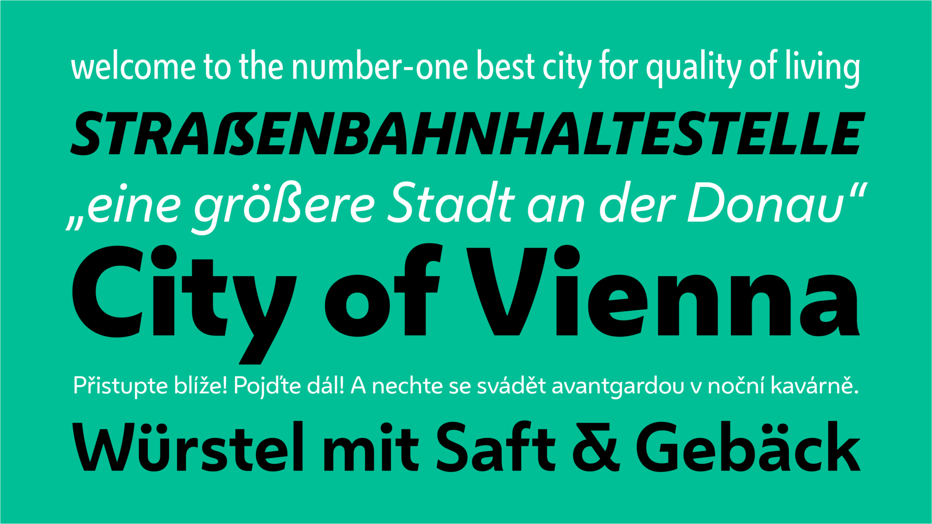
Riccardo: I think that a typeface has the power to unify the visual language and the flavour of the communication across a location. For example, the typeface we created for the city of Vienna is very much intended to express the flavour of the city for locals and visitors alike. Similarly, the New York subway’s use of Helvetica (not us, alas!) is so well-established that it actually feels like a part of New York.
Bruno: A key typography project we worked on in a built environment was a typeface and identity system for Southampton City Council. We did the same for Manchester Metrolink with a typeface that was used for timetables, trams, buses, ticketing, and digital displays.
We also designed a typeface for the Kowloon-Canton Railway Corporation (KCRC) in Hong Kong which was used for station signage, trams, and buses. Actually, on that note, the work we did for Dubai Metro falls into the category of both wayfinding and place branding, where we created both a Latin and Arabic together.
Alison: That’s interesting because, at the moment, we're working on projects in Asia using simplified Chinese text. How do you approach dual-language projects?
Riccardo: We don't want to create a hierarchy. We want to develop them in a way that places them on the same level. We want to understand the tradition of each writing system and study that.
Having worked on many writing systems, we have an established base of research we can draw upon. We need to be able to translate a typeface visually across different systems so that the reader gets the same look and feel – the same reaction.
Bruno: I think another important aspect is to get an understanding of the visual culture. As Westerners, we have a tendency to impose our visual culture onto others.
For example, we might perceive a geometric typeface as progressive and modern looking but the same style in Arabic does not necessarily project the same meaning. And I think it's there where you have to understand that visual culture to get the same feeling. Especially where you are in dual or trilingual environments, you have to approach it very sensitively.
Projecting Personality
Alison: Sometimes, we want to bring in some of the brand's design and personality to a wayfinding design. And other times we want to break those rules a little bit. From a typographical perspective, what’s your opinion on wayfinding breaking some of those established design rules? How do you balance style with accessibility?
Bruno: I’ve actually come to realise that accessibility comes in three components: emotional, functional, and technical. And you cannot separate them out. You need to have three components because they need to work together. And that inevitably requires compromise.
However, accessibility in typography is really poorly defined and it’s largely based on opinions that have little or no scientific backing. I’ve been doing a little bit of research into accessibility from a neuroscientific point of view. There’s been a lot of work done on how the brain actually reads and how it deciphers and decodes letterforms. What the brain is actually concerned with is ambiguity.
The more ambiguity you have between individual characters, the more difficult it is for the brain to actually decode these individual characters. The brain is primed to recognise word shapes – but we don’t read word shapes; we actually read individual characters. Good typographic practice is to slightly space characters because that will help the brain to decode.
At the end of the day, if you follow established principles of good typography practice, you will be fine.
Riccardo: I think it's important to add that these things sometimes come from a practical angle as well. So, both the idea of using sans rather than serif and the idea of using mixed case, rather than all solid uppercase also comes from the fact that you save space.
Sans serif maybe is a bit more arguable. But I think among the challenges that we mentioned above, there is also the real estate, – how much information are you able to squeeze in a certain surface at the larger possible size, in order to maintain your contents accessible. So, you know, it's important to have compact shapes.
Bruno: I absolutely agree but I think challenging conventions is important too. For example there are some misconceptions about Swiss typography – that it’s a style composed of clean straight lines, everything minimalistic etc.
I would argue that it’s an attitude; not a style. Swiss typography is the journey of finding the best possible solution, the best possible outcome to a problem. And if that outcome requires a bold, super-tightly set Helvetica, well, then that is Swiss typography.
If the outcome requires an ornate and ornamental script typeface, then that is Swiss typography. It's that journey; it's a process. That's what Swiss typography is: finding the best possible solution to a problem.
Alison: That's a really nice way to think of it. Finding the right typography is about finding an attitude rather than a style.
Established Environments
Alison: How then might these issues impact legacy typography in heritage brands? What are some of the challenges here?
Bruno: When you have a really strong sense of heritage it can be very difficult to make a radical break as you’ll inevitably be alienating a part of your audience. With a heritage brand, you’ll probably want to continue the heritage and the visual expression of it within the typography. So you have to gradually shift it over time, moving towards a different direction.
Riccardo: You want to ensure that your brand looks specific according to its heritage, with a precise identity. But also that it feels current, and shows to belong to a certain industry. And that can be a risk, because all museums in the year 2020 might start looking the same.
Alison: I suppose when it comes to certain institutions, trends become important to them. Actually, I'm really interested to hear your opinion on the homogenisation of spaces like airports. With most airports adopting Frutiger yellow or black type, they all feel the same now. What are your thoughts?
Bruno: For a lot of designers it's the safe option because it’s deemed to be optimal. There are proven typographically established norms like foreground, background, and contrast. We know we want a high – but not glaring – contrast. So you have black on yellow, like in traditional book design where you have slightly off black on slightly off-white.
Alison: But doesn’t it frustrate you? That all around the world, airport signs look *exactly* the same?
Bruno: For me, what’s most important is the narrative of the wayfinding – how I’m guided through the airport. And in many cases, be that airports or another situation, it's really poor.
Riccardo: When I'm in an airport or when I'm driving on the highway, there is a sense of urgency and I'm prepared to accept homogeneity. Whereas it bothers me when I see something like a bar that has the sign set in big, lowercase, Verdana letters - a typeface that was created for on-screen legibility in the 90’s. It feels out of place, like it doesn't have any character.
So for each project, it's about defining what the creative brief is, what the limits are, and where you balance personality with functionality and the ability to help you navigate the space. Letters build an identity and can be powerful, both in making strangers relate to a place when they pass by and for the person who lives there.
Alison: I think legible cities projects are highly functional and really help people who are completely lost. But I also think back to the time before they existed when each borough did their own thing in London. And I really liked the fact that when you go through different areas of London, there used to be different sign systems, and you really knew where you were based around that sign system.
Riccardo: There is a movement internationally towards standardisation. And I think the legible city was probably a pioneer project in that sense. But there is also a return to an appreciation of the local identity. This gives designers opportunities to draw from the tradition of that specific place, which is very exciting and promising going forward.
Dealing with Digital
Alison: The fact that most people now use Google Maps if they're lost somewhere, rather than rely on what they can see in the actual environment means that maybe there's a bit more room for that craft, and that localisation to come back. And I wondered whether you think that might happen with typography?
Bruno: I am not so sure that there is a big appetite to spend public money on projects that are perceived to be ‘vanity’. Of course, people would want this kind of personalisation and identity but are they also prepared to spend for the effort it takes?
Riccardo: There is also an established tradition of architects dealing with public lettering. And I think you need to account for the fact that there are professionals that deal with that thing specifically. So it's not just a case of beauty.
An architect may treat a piece of public lettering as a beautiful thing to look at but not understand the legibility and accessibility principles behind the letter shapes
Alison: For sure. Just because you have a computer and you have a series of fonts, that doesn't make you a typographer, right?
Architects quite often take on wayfinding because they deal with buildings. And so it ends up being put into their project. But they're not necessarily experts in wayfinding. They're experts in crafting amazing buildings. We need more clients to really understand the value of getting an experienced team to do it.
On a final note, what do you think the future holds for typography, the built environment, and wayfinding?
Riccardo: I think the line between cartography (your map) and your wayfinding (signs around you) is blurring and we’ll go into a future where the experience of space will happen through a device that somehow merges your ability to discover what's immediately around you and what is further away. With augmented reality, I think the key will be the responsiveness of type to adjust to the context. So the type will adapt depending on your visual landscape in order to become stronger and clearer.
Bruno: I think variable fonts are a sticking plaster to solve one immediate problem for the tech giants. Everything they produce is on the web. For them, actually being able to deliver fonts and the range of typographic expressions very efficiently and quickly across devices – that's their primary aim.
They forced variable fonts upon us all! And it's built on 30-year-old technology. In that respect, there hasn't been any innovation in that area and we should be looking towards changing that as our next challenge!