


How Lee got started in colour
Since childhood, Lee had an innate ability to choose colours, and put colours together. Lee’s parents were a huge influence – her father was in the field of fashion, and her mother loved colour. Instead of spring-cleaning, her mother would repaint the house! From a young age, the adults in Lee’s family asked her for advice on what colours to put together. She seemed to have an innate sense for colour.
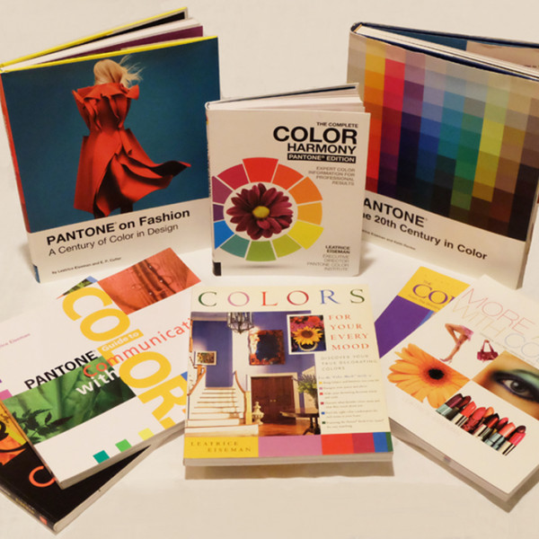
Later, at UCLA, Lee was allowed to take her own programme in colour. She then taught colour for the LA Unified School District, creating a prototype class. One day, Lee’s husband heard her concept and encouraged her to publish it – before someone else did. That was the start of Lee’s colour journey. Since then, she’s written 10 books on the subject.
Ways to define colour
Colour is different for different people. Through studies by the Pantone Institute and her own clients, Lee identified that colour evokes different emotions. These are sometimes cultural associations learned as children, such as red is dangerous (fire), and pink relates to Valentine's Day.
At the same time, there’s also evidence to suggest we have an innate sense of colour – something buried deep in our psyche. There are always exceptions, but studies show there are general trends in how we perceive colour. That’s especially important in the field of branding and how consumers perceive certain colours – or colour in context.

The emotional response to colour
One of Lee’s main commercial activities is helping companies choose their corporate colours. Her work is backed by studies, which help to dispel common unfounded myths around colour. For example, there is no evidence that using yellow in a home causes anxiety. In fact, yellow is actually recommended for people who suffer from Seasonal Affective Disorder (SAD) because of its associations with sunlight.
Lee’s expertise takes her wherever colour is needed or necessary. In today’s commercial world, it’s important to know about colour and to get that knowledge from an expert. Colour word association studies are an integral part of keeping up to date with the general precept of colour. One example is brown. Traditionally associated with earth and the country, in more recent times it’s become more elevated and sophisticated – think the 2000 film Chocolat, Michael Kors fashion, and demand for browner shades of lipstick.
Perceptions of colour are influenced by psychological and physiological trends, and the influences out there in the world around us – our culture and time period. Older generations may still have precepts around colour. On the other hand, younger generations are not as mired down in pre-existing concepts of colour. The world of online top-level influencers means colour trends travel quickly around the world – people are much more open to newer and fresher colour ideas.
The age of a company’s target demographic can play a huge part in determining the choice of their brand colours. This makes colour research essential.
Cultural influences on colour
Someone’s past – where they grew up, where they live, the era they grew up in – all influence their perception of colour. Different cultures have different interpretations of colour. For example, a colour scheme that works in London may not work in Singapore. When it comes to signage that helps people find their way – there might need to be more of a rationale and reasoning behind certain colour choices.
As colour is so subjective, working with it at scale – such as within a large interior space – can be difficult to get right. People have very personal perspectives on colour choice. Digging below the surface, often a person’s reaction to a particular colour is rooted in their own belief system or a childhood experience. With clients, this requires careful and elegant handling, but it’s this aspect of colour that Lee really loves. That’s why brands, products, and services need evidence-based colour choices that positively impact their bottom line.
The challenge of colour matching
Getting a brand colour right is a huge aspect of branding. In wayfinding, the challenge comes in matching the colour across different materials – because this has an impact on the closeness of the match. From Lee’s earliest days in doing colour and colour matches, different substrates have always been an issue. Even in the Pantone books, there’s a disclaimer that colour can always vary slightly. As with many things in life, striving for perfection rarely ends well.
What’s important in the closeness of the match is that the colour maintains the emotive quality.
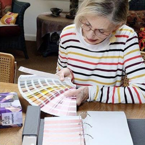
Fortunately, a colour expert with a well-versed and well-educated eye can help make a difference in colour choice. Colour experts like the scientists at Pantone speak a shared language to communicate degrees of difference in colour.
Choosing the Pantone colour of the year
There’s more to picking the Pantone colour of the year than people think. It has much to do with the zeitgeist and what’s happening in the world today. As a forecaster, Lee has to have her finger on her pulse ahead of time to predict upcoming trends.
The psychological impact is important, and there are other considerations as well. Are designers using it? Is it being used in high-end retail (where trends usually start)? Is it popular in streetwear?
With millions of eyes trained on them, films also greatly influence colour. Is the colour itself getting a lot of cultural buzz? Art is also a huge consideration, as is the automotive industry and concept cars.
Learn more about Lee’s life and work in colour at leatriceeiseman.com
Our podcast is available on Spotify, Apple Podcast and YouTube. Don't forget to subscribe and rate us!