A brand isn't really something which can be directly designed, instead of being the product of lots of other things which can. You can design a logo and advertisements, specify brand guidelines, etc., but a brand itself is really the end result of how people perceive these things along with the products and services they represent. The brand is effectively peoples cumulative reaction; be it their gut feeling to all of these things and as such not that straight forward a concept to grasp, and also not that easy to control. Imagining brand value as stocks and shares which rise and fall is one way of assimilating it and on this count checking out Interbrand vs Millward Brown's assessment of the Top 100 Brands over the last few years, and comparing your own gut feel might prove insightful.
Don't worry I won't be dwelling on a brand definition, but appreciating this should hopefully make the importance of how branding is applied more apparent; as this is one of the factors you can control.
The physical implementation of a brand is a very important step, and one aspect of this is, design to ensure the end result aptly reflects the qualities that the brand seeks to portray. For the large part, this tends to involve some form of migration from 2D to 3D, but can also involve applying engineering design to countless other applications linked with a brand, large and small, they all play their part.
It can be all too easy to regard the end result at face value, but instead, in this article, I'll take a step back and look at the design engineering which goes into achieving that end result by looking at two of our clients and the sort of things we have designed for their brands.
Knight Frank
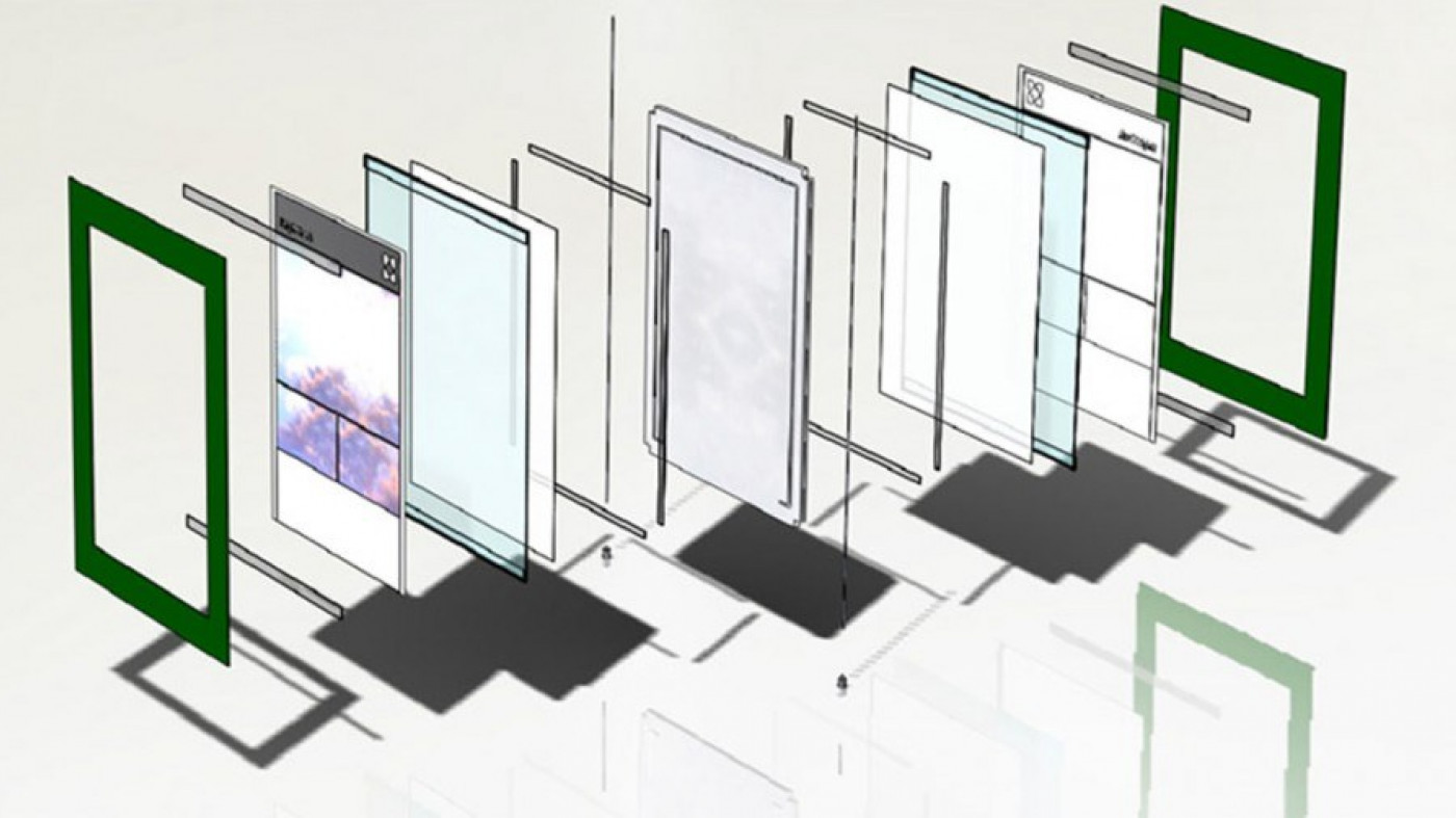
A good example of a branding-related product is the window display units we designed and developed for Knight Frank. While illuminated displays of properties in the windows of estate agents are a given requirement, such units can tend to be a mess of fittings and fixings, which are as much on display as the desired content. Yet this simply shouldn't be the case as these are purely functional entities and are far from cosmetic.
Our approach was to go back to basics and think about the core purpose of the product and design it accordingly. Knight Frank, being at the elite end of the property market, tend to be dealing with multi-million-pound properties and with this in mind we set about streamlining the design, simplifying it to draw the focus on the displayed content and essentially neatly framing it to create a more elegant solution. With our reworked system, there are no unsightly fixings, just a perfectly illuminated suspended double-sided frame into which any graphic can be slid front and back.
This is achieved by precision machining a special acrylic panel in such a way as the need for fixings is eliminated. In so doing we have created a unique product that stands out for its bold simplicity in a market ever increasingly flooded by alternatives. However the difference is evidently instantly apparent to those who feel that our design aligns with their brand; the first of our displays were installed on a Friday, come first thing Monday we had two enquiries from potential clients who had seen them and asked who designed them.
Following the success of the system trial at their Sloane Avenue branch, Knight Frank has gone on to adopt our system nationally.
Tate Modern
Being as it is the most visited modern art gallery in the world with a yearly footfall of almost 5 million (set to skyrocket this year thanks to the Olympics), Tate Modern offers a fantastic environment to design for. Since its launch in 2000, it has been defined by a strong consistent and uniquely accessible brand, lending itself neatly to the building and all gallery elements within it, which many would argue has had a large part to play in its success.
Following the decision to charge for the gallery maps, Cartlidge Levene was commissioned to design new maps, along with a means for their distribution. On this count, they came to Endpoint with their visual designs for map dispensing units to develop these into functioning products. This offered an interesting challenge in many respects as the units required a simplistic, bold look and yet also had to meet numerous functional requirements, along with providing the durability to survive in what is quite a hostile environment due to the sheer volume of visitors.
There are three types of unit; desk mounted, wall mounted and freestanding — all in varying sizes. All units must accept and house money in a viewable capacity (money on show creates greater participation in what is an honesty scheme), yet remain completely secure. They must also be quick and easy to empty by Tate staff. In the case of the free-standing units, these also required the design of an additional product, unseen by the public, to assist with their emptying.
We were keen that the look and feel should in no way be compromised by providing the relevant functionality. The clutter of visible locks, screws, wheels, etc. would detract from the design, and not fit the brand, so a great deal of thought went into conceiving ways in which all of the functional elements could be completely hidden. The next stage was to design the relevant systems along with the structure, specifications, components and materials before commencing manufacture in order to ensure delivery in what was an incredibly short lead-time.
The units were well-received and can be seen throughout Tate Modern. We are currently producing another unit with extra functionality, while the design is also being reworked for Tate Britain, to replace the existing map units there as well.
In summary, I hope this brief rundown gives a bit of an insight into the design engineering side of brand implementation. It really does depend on the client and the project as to what is required.
Feel free to pose any questions on Twitter and I'll do my best to answer them.
Resources
www.millwardbrown.com
www.superbrands.uk.com
www.interbrand.com/bestglobal-brands-2011
www.slideshare.net/the-brand-gap
www.wolffolins.com/tate