The Challenges
The challenge was to create an external wayfinding and signage system which was not overbearing. This was complicated by the hotel entrance positioned on a side road, not the plaza, and therefore less prominent. Environmental graphics were also needed for the cycle parking bays allocated to residents and staff.
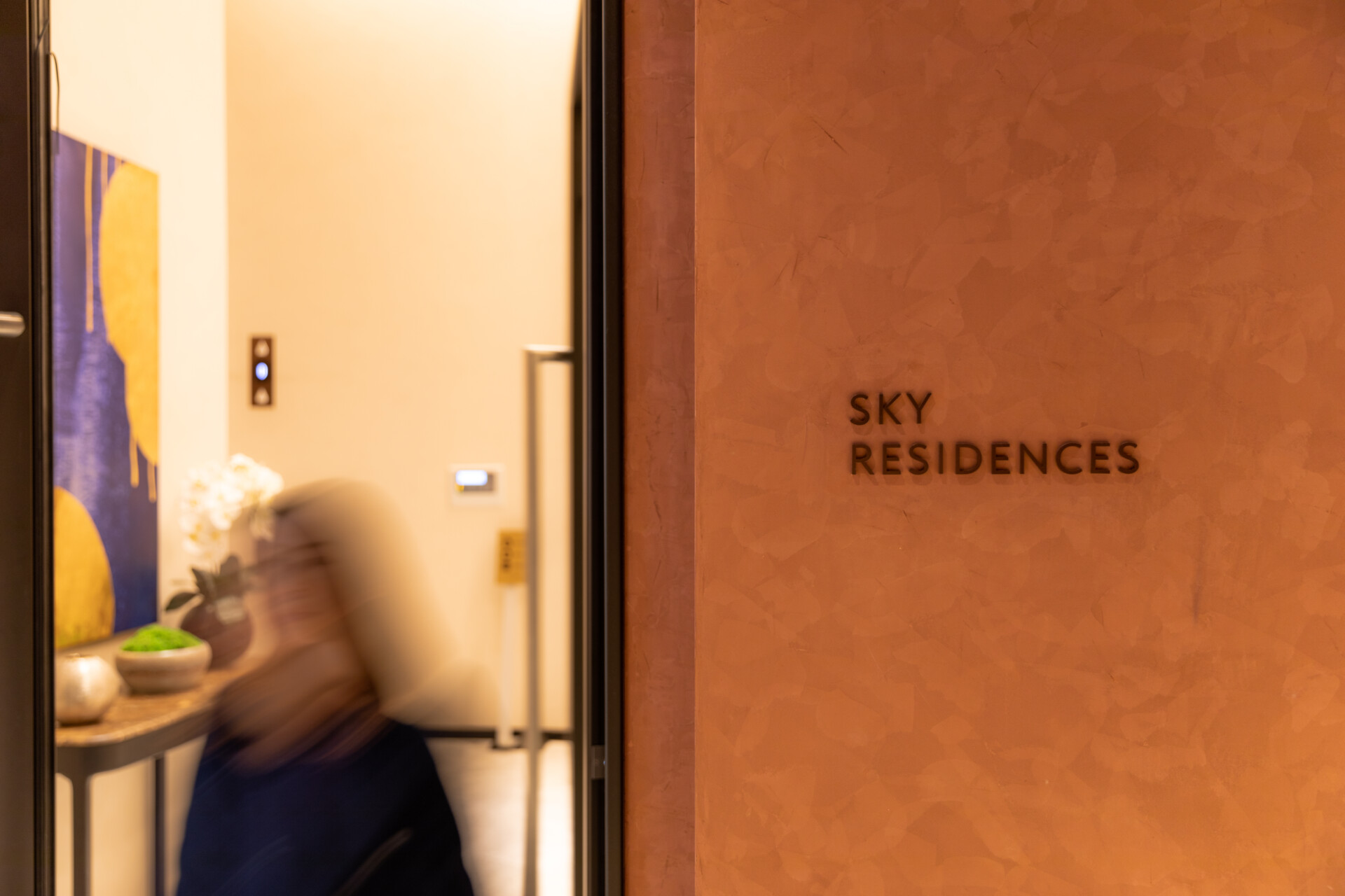
During a brief hiatus from development, the project went through some internal architectural and space allocation changes. This created new wayfinding challenges. For example, the residents' concierge was moved up to the Sky Lobby. For differentiation and discretion, the residents’ signage also needed to be less obvious and blend into the surroundings.
In addition, the back of house and basement housed facilities for both hotel operations and building operations, respectively. This shared space required a clear wayfinding system for both teams.

The Solutions
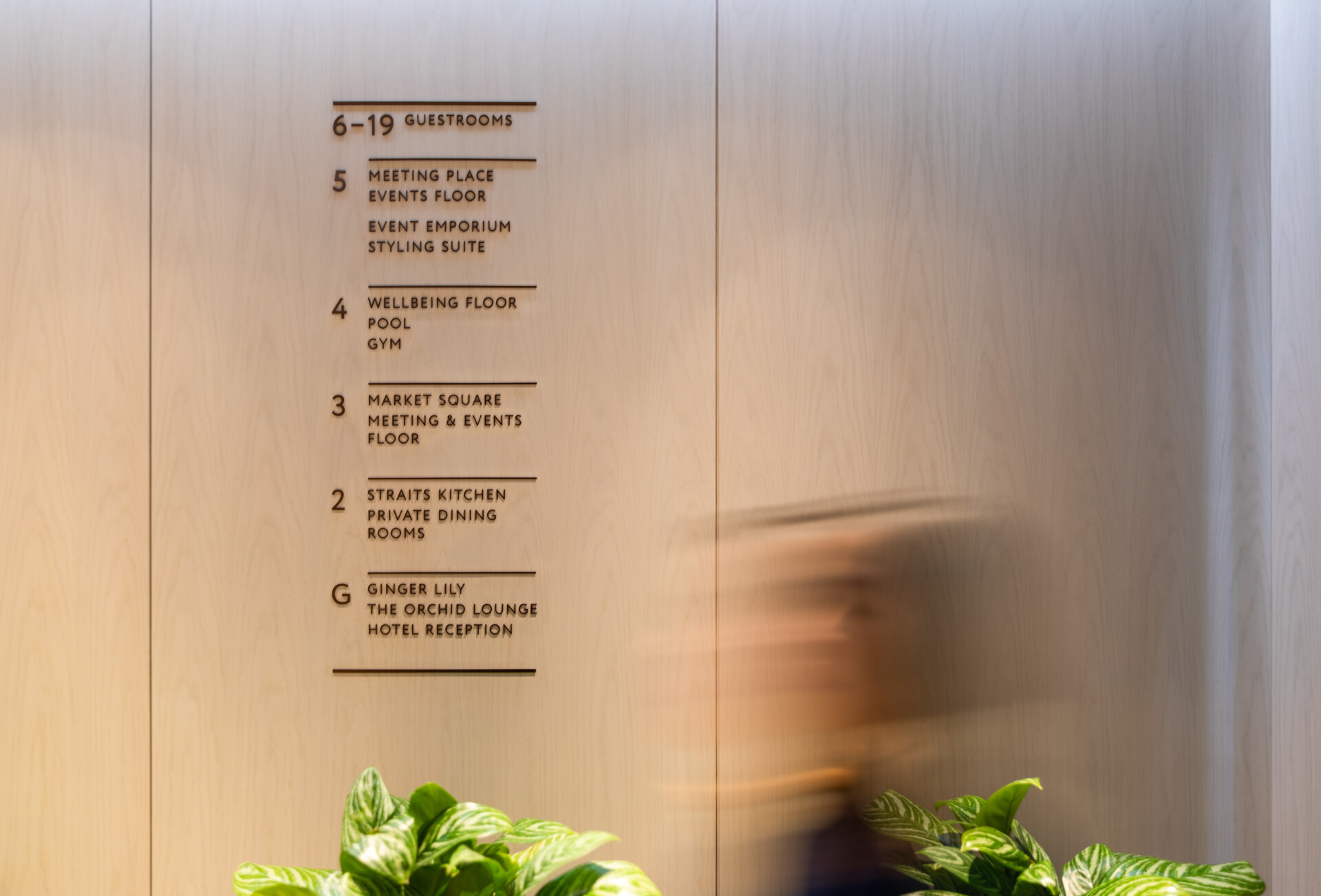
Drawing upon the country house theme, we developed a signage system using a sans serif font that was beautiful, clean, and complemented the residential and hotel branding. The form was simplistic and provided clear direction and visibility. We complemented the lettering with pictograms and arrows that were both simple and unobtrusive. The design also aided the implementation of good wayfinding practice in the sign family.
Externally, we added a logo to the corner of the building, which could be viewed from the plaza. This simple touch helped to increase awareness and improve the wayfinding experience for guests. Overall, we kept residents’ signage to a minimum, so as not to draw undue attention to it.
Inside, we created two sets of back of house signage, one for each team. Hotel operations had gold lettering on a black background, whereas building operations used black lettering on a gold background. This simple colour difference made it easier for staff to know if they were standing at a hotel door or an operational team door, just by the colour.
For the cycle parking area, we created graphics which matched the environment and the rest of the signage system. The floor graphics incorporated a bicycle tyre track with bicycle pictograms that took users to the numbered bays.


The Impact
One Bishopsgate Plaza now has a unified wayfinding and signage design spanning different types of spaces and meeting the needs of various users. Externally, the user-journey is clearly signposted without being overly obtrusive, whilst internally subtle distinctions are made between residents and guests, building operations and hotel operations.