The Challenge
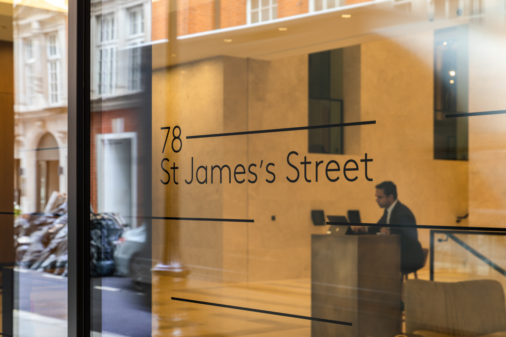
78 St James’s Street is a historic Georgian building and a St James’s landmark, designed in 1840 by Sydney Smirke. The range of listed design features includes elaborately painted ceilings by Frederick Sang. Last restored and modernised in the early 2000s, the most recent refurbishment preserves key heritage details, such as the font entrance and vaults, whilst providing premium office and leisure facilities.
In order to preserve the iconic original entrance, which retains its use for high-end events and gallery reception, the main entrance at the side of the building was extended. In addition, the basement and former home of the bank vaults will be transformed into a café. From a wayfinding and signage perspective, the challenge was to help unite this blend of the historic and modern together with the brand identity.
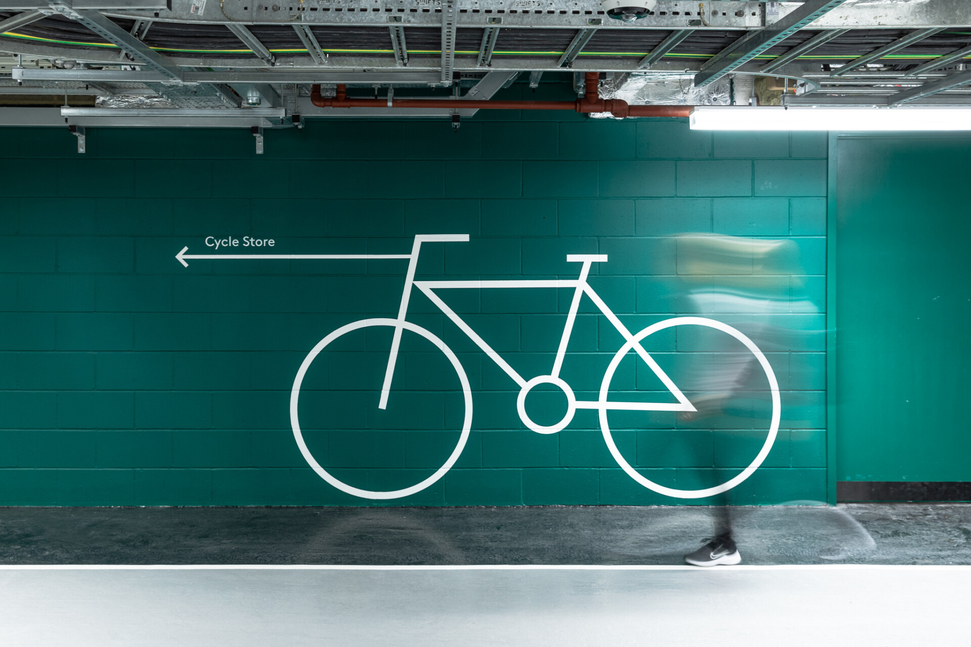
Using the logo and font provided by the client as a launch pad, Endpoint needed to devise complementary wayfinding signage, pictograms, and environmental graphics (for the entrance, car park and cycle storage) which aligned with the brand identity and respected the past and present interior design and usage of this iconic building. In particular, capturing the sense that you could almost live in this building with its high-end hotel and spa-like experience.
The Solution
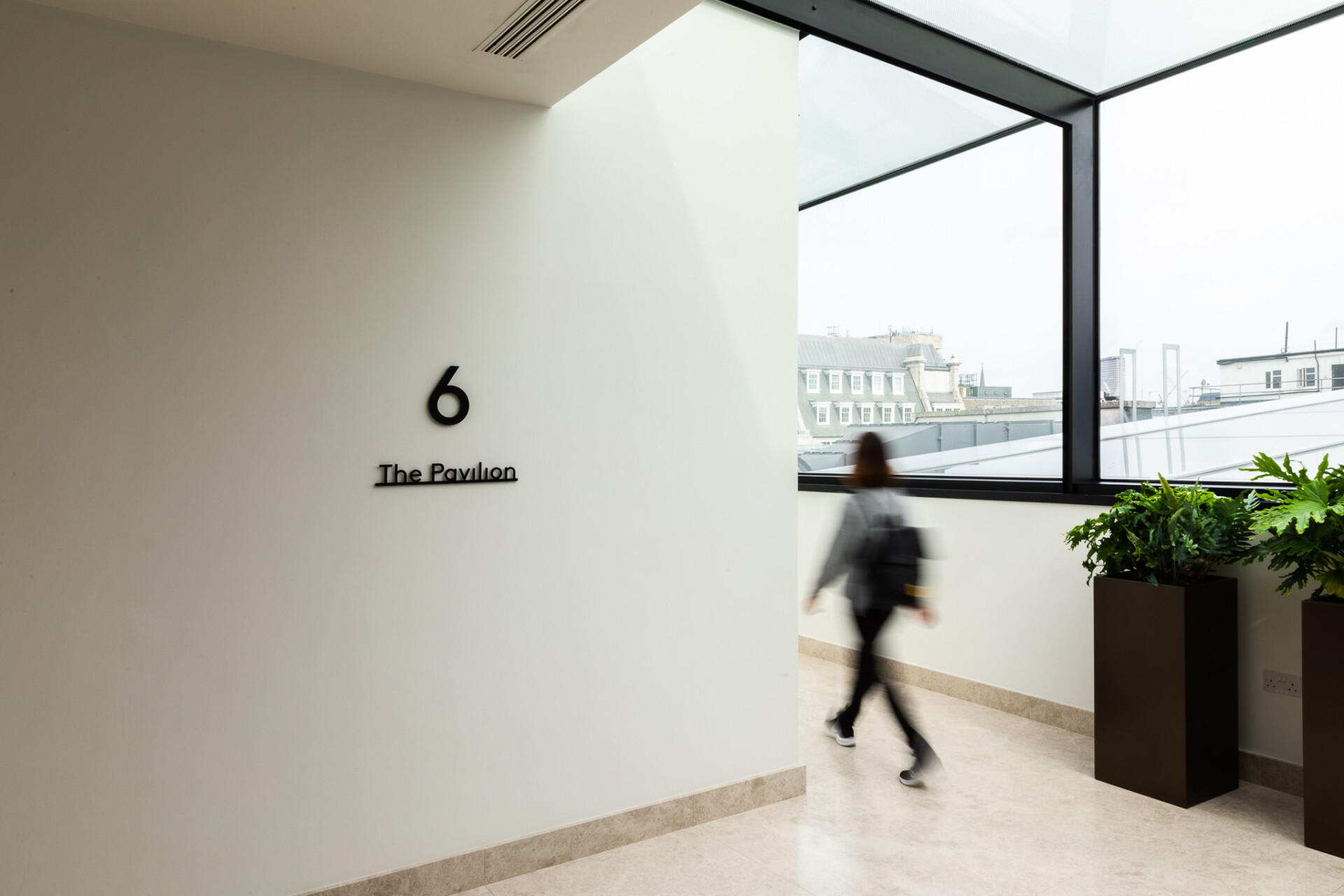
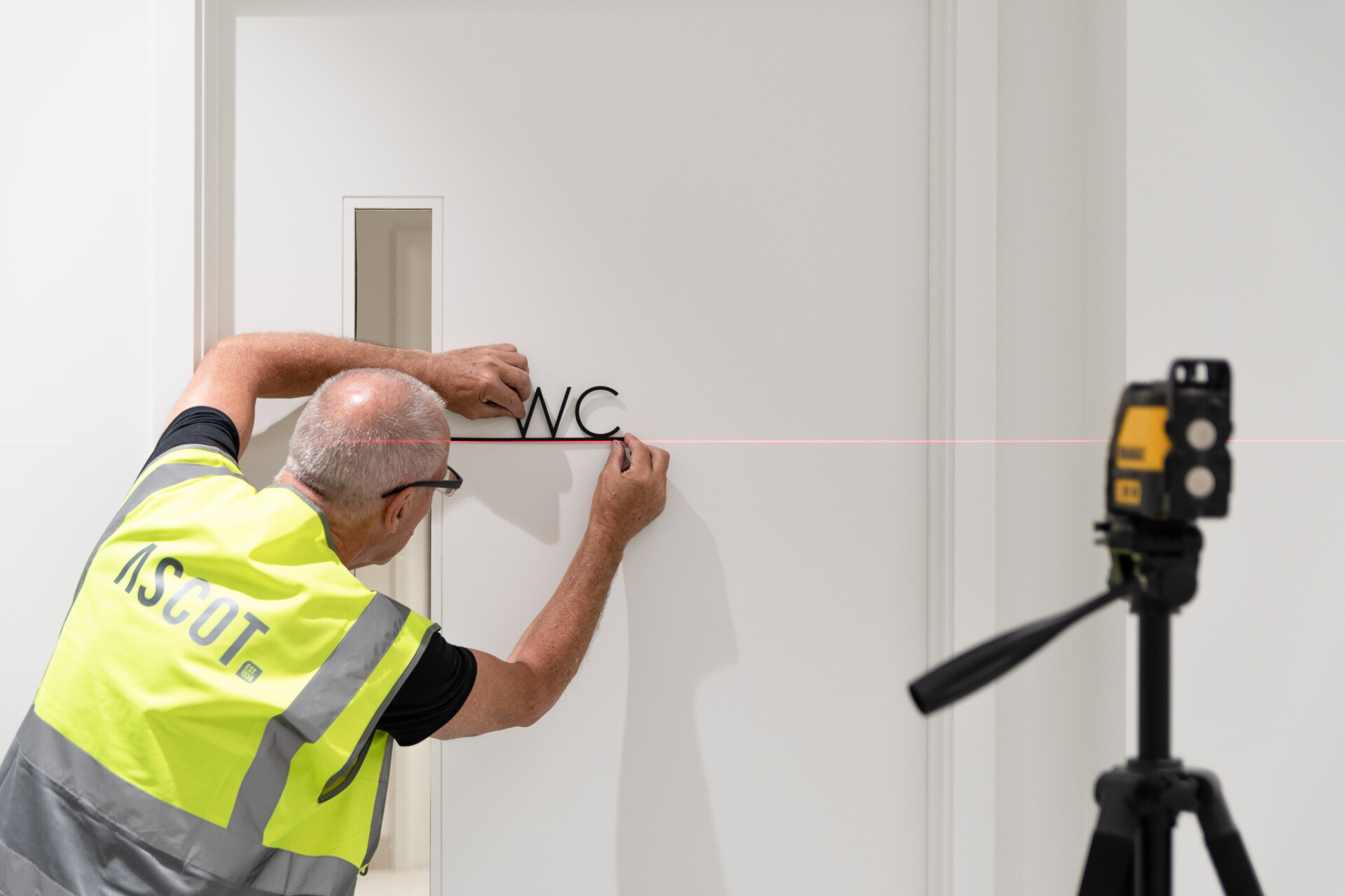
Taking the font and line work as our creative cue, we enhanced the pictograms and signage to create a cohesive and unobtrusive theme. For the heritage entrance, we kept to a simple adhesive plaque, to minimise disturbance to the building. This approach extended to the historic marble walls, which the client was keen to preserve, without multiple drill holes to accommodate the signage.
A mounted letter solution would usually require at least one pin per letter, so we decided to incorporate a rail to reduce the number of pins needed in the wall. This had the added advantage of making the signs easier to remove and replace – should the need arise in the future. We also aligned the wayfinding signage with the branding by incorporating the extended line detail from the logo.
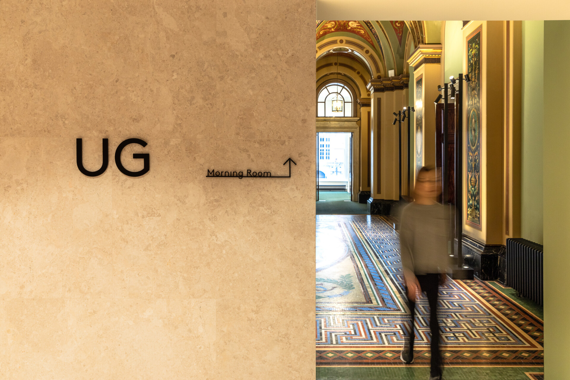
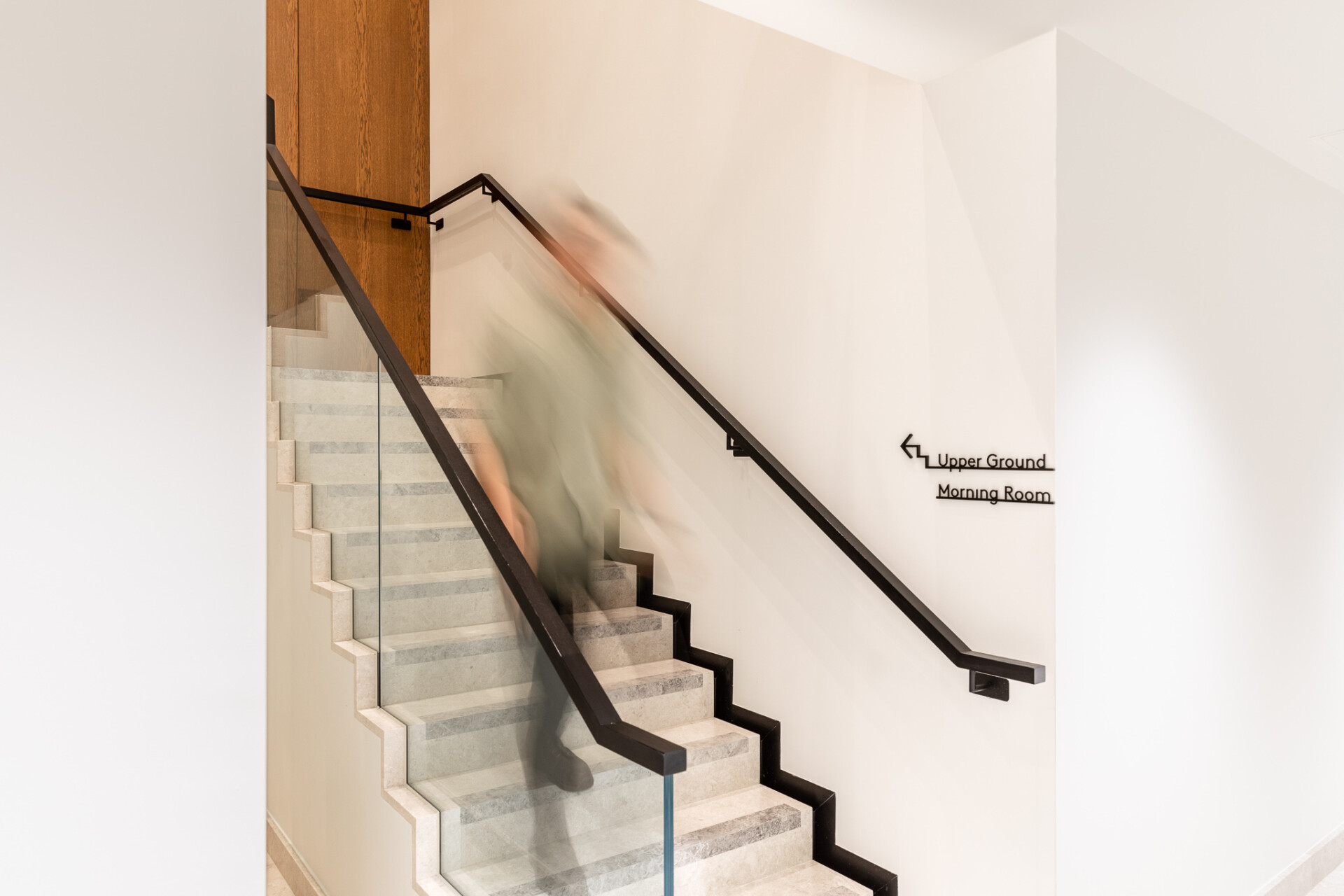
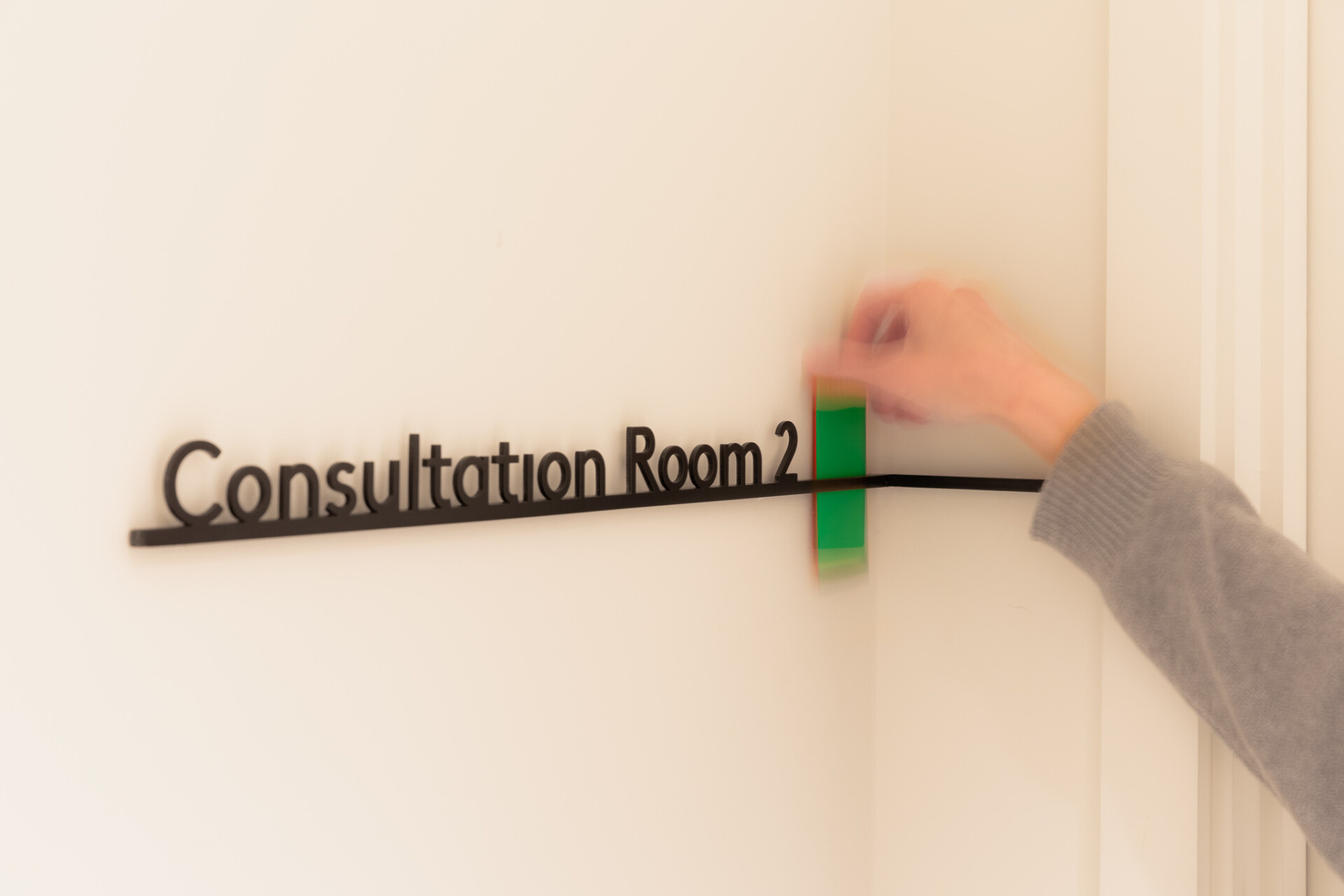
We also presented the client with a range of fixing options from flush to the wall to offset and removable. Offsetting provided the versatility to decorate behind the letters without having to remove them or risk painting over the wall-mounted signs. The client opted for the most pragmatic solution which involved offsetting the letters from the wall.
In terms of the vinyl signage mounted on glass, colour was a key consideration for the client. Whilst frosted and white variations were initially in the running, when samples were tested on location, it became clear that black was the obvious choice as it was clearer to read in daylight and was much more on brand.
Overall, the end result is a wayfinding signage system which complements the history of the building, whilst helping to bring it to life for a new generation of office workers.